Usage Monitoring
Denne siden beskriver arbeidsflyten i LKG for Billing steg for steg.
Åpne riktig meny fra sidepanelet og følg flyten på skjermen.
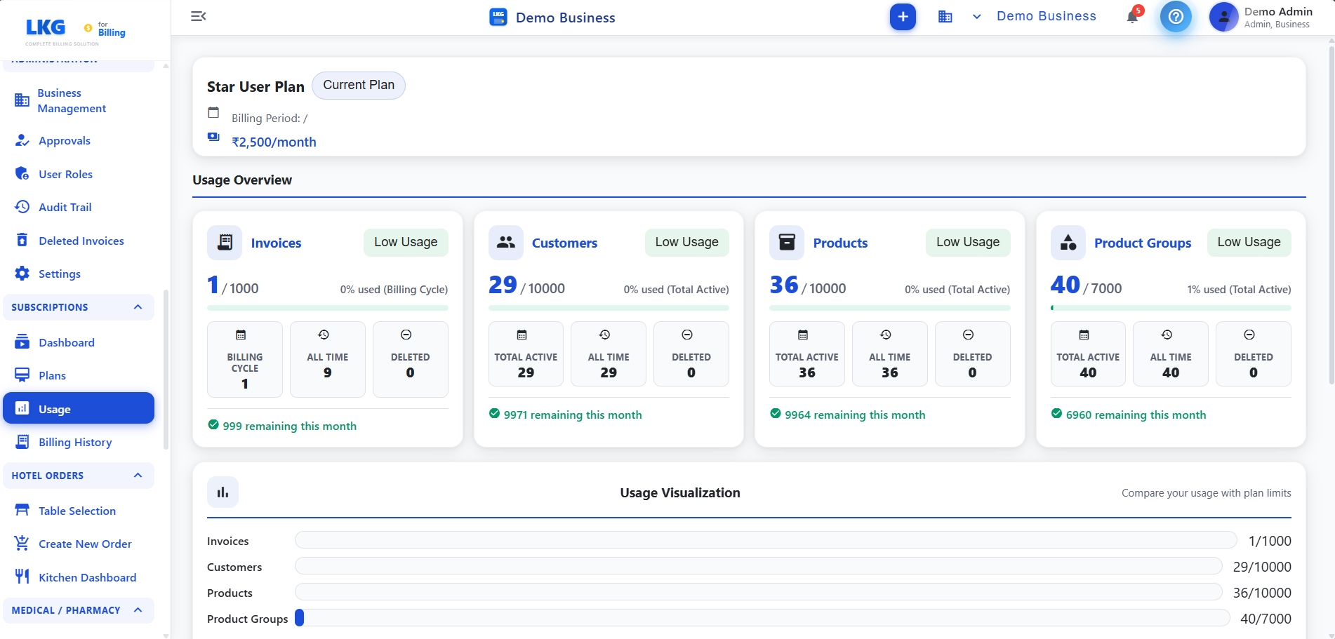
Oversikt
Bruk siden til å gjennomgå gjeldende poster, bekrefte viktige detaljer og holde data konsistente på tvers av fakturaer, produkter, rapporter og kundeflyter.
Arbeidsflyt
- Velg relevant dato, kunde, produkt, medarbeider eller statusfilter.
- Gå gjennom detaljer i tabeller og sammendragskort.
- Lagre endringer eller eksporter rapporten.
Viktige felt
| Felt | Beskrivelse |
|---|---|
| Navn / referanse | Primært postnavn, kunde, produkt, medarbeider eller rapportreferanse |
| Status / dato | Gjeldende status og datoen som brukes til filtrering eller oppfølging |
| Beløp / antall | Beløp, produktmengde, antall eller annen målbar verdi |
| Handling | Åpne, redigere, dele, eksportere, godkjenne eller slette basert på rettigheter |
Driftstips
tips
Nøyaktige datoer og referanser gjør rapporter og revisjonsspor enklere.
notat
La bare autoriserte brukere endre viktige innstillinger eller økonomiske data.