Usage Monitoring
このローカライズ済みガイドでは、LKG for Billing におけるページの目的、主なフィルター、表、ステータス、操作を説明します。
Monitor your real-time resource consumption against the limits defined by your subscription plan.
メニューからこのページを開きます。
Limit Status Bar
The top bar shows a quick summary of your most constrained resource:
| フィールド | 説明 |
|---|---|
| Resource Progress | Progress bar showing usage (e.g., "Invoices 6/10") |
| Status | Near Limit (red badge) when approaching the plan limit |
| Upgrade to Increase Limits | Button to upgrade your plan |
Usage Overview
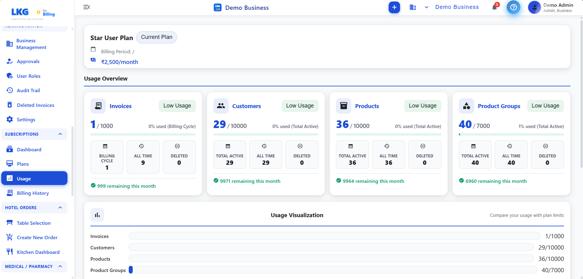
Four resource cards are displayed showing your current usage against plan limits:
| リソース | 説明 |
|---|---|
| Invoices | Number of invoices used vs. plan limit (e.g., 6/10) — with usage percentage and status badge |
| Customers | Number of customers used vs. plan limit (e.g., 3/10) — with usage percentage and status badge |
| Products | Number of products used vs. plan limit (e.g., 8/20) — with usage percentage and status badge |
| Product Groups | Number of product groups used vs. plan limit (e.g., 3/10) — with usage percentage and status badge |
Status Badges
| バッジ | 色 | 説明 |
|---|---|---|
| Near Limit | Red | Resource is approaching or at the plan limit |
| Low Usage | Green | Resource usage is well within limits |
Resource Detail Cards
Each resource card expands to show detailed breakdown:
| フィールド | 説明 |
|---|---|
| Billed | Number of billed/active records |
| All Time | Total records created all time |
| Deleted | Number of deleted records |
| Total Active | Current active count |
| Active | Number of active records |
| Deleted | Number of records deleted |
| Remaining this month | Remaining quota for the current billing period (shown in green) |
| Remaining this month | Records still available to create (shown in red if near limit) |
Usage Visualization
A horizontal bar chart at the bottom compares your usage with plan limits visually:
| リソース | 説明 |
|---|---|
| Invoices | Bar showing current usage vs. plan limit (e.g., 8/10) |
| Customers | Bar showing current usage vs. plan limit |
| Products | Bar showing current usage vs. plan limit |
The chart title reads "Compare your usage with plan limits" — providing a visual overview of how close each resource is to its limit.
Warnings and Alerts
Near Limit
When a resource is approaching its limit:
- The resource card shows a Near Limit badge (red)
- The top bar highlights the constrained resource
- An Upgrade to Increase Limits button is prominently displayed
At Limit
When a resource reaches its plan limit, creating new records of that type is blocked. You must upgrade your plan or delete existing records to free up capacity.
使い方
- メニューからこのページを開きます。
- Review the top bar for any Near Limit warnings
- Check each resource card for current usage vs. plan limits
- Expand cards to see detailed breakdown (billed, all time, deleted, remaining)
- Review the Usage Visualization chart for a visual comparison
- Click Upgrade to Increase Limits if you need more capacity
Monitor your usage regularly, especially for Invoices which tend to grow fastest. Upgrade before hitting limits to avoid disruptions.
関連トピック
- Subscription Plans — view limits per plan and upgrade
- Subscription Dashboard — overall subscription status
- Billing History — past payments and invoices